7 Ways to Cut a Hole in a Gradient
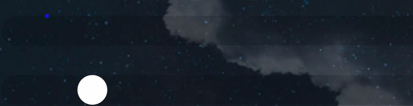
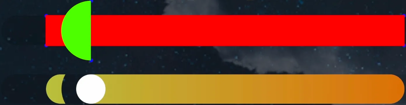
I was interviewing at a company, and they asked me to do a technical assignment. I had to build an Apple Weather app based on a Figma design, using React, TypeScript, and any libraries I might need. The app had to fetch weather data from any weather provider. A pretty common task, nothing special… but there was one part I didn’t know how to implement. It was this component: a gradient line with a cut-out right under a white dot.
I had three ideas for how to do it:
- Give the dot a
borderwith the same color as the background behind the gradient. - Use
mix-blend-modeCSS property. - Or do it with 3 elements: two gradient elements with a white dot between them.
First, I tried the “cut-out” illusion using mix-blend-mode, but the result didn’t look like what I needed at all.
The three-elements idea worked nicely at first, but when I got to the rounded part of the gradient where it touches the “cut-out”, I realized I had no idea how to do that.
Time was limited, I had no better options, so I went with the border trick using the background color behind the gradient.
But I couldn’t stop thinking: what’s the better way to do this?
And one day, I suddenly came up with a few more ideas. In this video, I’ll show you 7 different ways to create this kind of cut-out.
clip-path: path()
My first idea was to use clip-path CSS property. With this property you can cut out shapes from an element. clip-path has a few functions to describe the outline of a shape: everything inside the outline is visible, and everything outside is hidden. In our case we need the path() function. It lets us describe the shape using path commands — and that path will define the cut-out.
Here is the CSS that cuts out the shape we need:
.clip--path {
  clip-path: path(
    evenodd,
    "M 0 0 H 489 V 40 H 0 Z M 61.125 -20 A 40 40 0 1 0 61.125 60 A 40 40 0 1 0 61.125 -20"
  );
}
The first thing we notice: it’s hard to read… and writing it is even worse.
And if you start resizing the window, you’ll see that clip-path doesn’t adapt to the viewport width. That’s because in path() you can use only pixels. No functions, no CSS variables — path() doesn’t support them.
And this is where JavaScript helps.
Let’s quickly go through this code and see what it does.
import { getHoleData } from "../utils/getHoleData.js";

const fillElement = document.querySelectorAll(".clip--path");

function updateClipPath(el) {
  const width = el.clientWidth;
  const height = el.clientHeight;

  const { x, yTop, yBottom, r } = getHoleData(el);

  const path = [
    "M 0 0",
    `H ${width}`,
    `V ${height}`,
    "H 0",
    "Z",
    `M ${x} ${yTop}`,
    `A ${r} ${r} 0 1 0 ${x} ${yBottom}`,
    `A ${r} ${r} 0 1 0 ${x} ${yTop}`,
  ].join(" ");

  el.style.clipPath = `path(evenodd, "${path}")`;
}

const observer = new ResizeObserver((entries) => {
  for (const entry of entries) {
    if (!entry.target) {
      return;
    }

    updateClipPath(entry.target);
  }
});

fillElement.forEach((el) => {
  observer.observe(el);
  updateClipPath(el);
});
First, we find the element with the gradient and listen for its size changes using ResizeObserver. Every time the size changes, the updateClipPath function is called.
Inside this function, we take the width and height of the gradient element. From the getHoleData function we get all the data we need for the hole we want to cut out:
x— the X coordinate of the circle center,yTop— the top point coordinate of the circle on the Y axis,yBottom— the bottom point coordinate of the circle on the Y axis,r— the radius of the circle.
Next, we build the path. It’s the same path we saw in CSS, but here we can use the values we just calculated. Let’s break down what’s happening.
Two important notes before we start:
- In CSS, the X axis goes to the right, and the Y axis goes down. So positive Y values are below the X axis, and negative Y values are above it.
- In
path(), the letters are commands: move to a point, draw a line, draw an arc, and so on. Uppercase letters mean absolute coordinates, lowercase means relative. In this video we’ll use only absolute coordinates.
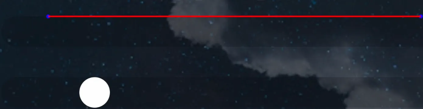
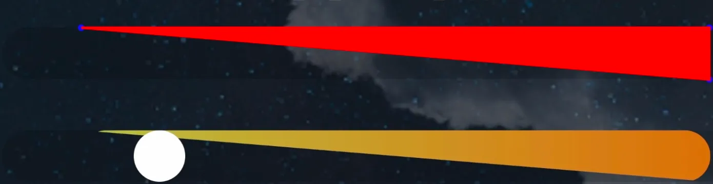
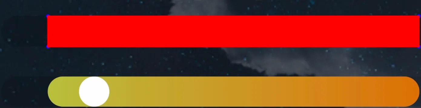
To make it more visual, I’ll add one more gradient element. On the top one I’ll show how the path is built, and on the bottom one you’ll see the final result after applying clip-path. Everything under red area will be visible. To make sure the white dot doesn’t distract you, I’ll hide it in the top element.
-
First we move to the point (0, 0) — to the top-left corner of the element.
-
Then we draw a horizontal line to the right for the full width. The shape height is still zero, so you don’t really see anything yet.
-
Next, we draw a vertical line down for the full height. At this point the path isn’t closed, so the browser automatically closes it by drawing a line from the last point back to the start. That’s why we get a diagonal cut.
-
Then we draw a horizontal line back to the coordinate 0 on the X axes.
-
And we close the path. Now we have a rectangle: everything inside is visible, everything outside is hidden.

-
Now we cut the hole. We move to the start point. Y is negative, so it’s above the top edge of the element (because the hole diameter is bigger than the gradient element height).
To get a full circle, we draw two arcs:
- the first arc with radius
rgoes to the bottom point. 2. the second arc back to the top point of the circle .
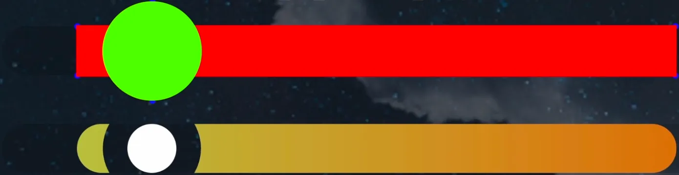
Congrats — we just cut a hole out of the gradient 🙂
The path() code is not very intuitive, but this approach has really solid browser support.
clip-path: shape()
But clip-path also has a function with a much nicer syntax — shape(). It supports not only pixels, but also other units (for example, percentages). And you can use math functions like calc() and CSS variables inside it. So we can do the same thing we did with path(), but using pure CSS.
Here’s how it looks:
.clip--shape {
  --x: var(--hole-position);
  --r: var(--hole-radius);
  --yTop: calc(var(--r) / -2);
  --yBottom: calc(var(--r) * 1.5);

  clip-path: shape(
    evenodd from 0 0,
    hline to 100%,
    vline to 100%,
    hline to 0,
    close,
    move to var(--x) var(--yTop),
    arc to var(--x) var(--yBottom) of var(--r),
    arc to var(--x) var(--yTop) of var(--r)
  );
}
In shape(), commands are written as words and separated by commas. If you want absolute coordinates, you use to. If you want relative coordinates, you use by.
If we compare it to path(), the idea is the same — but shape() is way easier to read. And the best part: now we can use percentages and values from CSS variables.
One important thing: support for shape() is still not perfect. Here’s the situation as of December 2025.
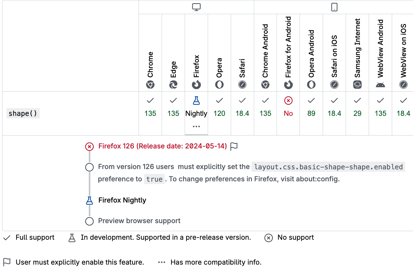
In Chromium-based browsers (Chrome / Edge) and Safari it’s already supported, but in Firefox it’s only available in the Nightly version if you turn on a feature flag.
SVG <clipPath>
Besides the CSS property clip-path, there is also a separate SVG element called <clipPath>. To define the clipping shape inside <clipPath>, you create a <path> element and describe the path commands in its d attribute — that path is what will cut the shape out.
<svg viewBox="0 0 1000 40" class="scale__svg">
  <defs>
    <clipPath id="svgClipPath">
      <path clip-rule="evenodd" d="M 0 0 H 489 V 40 H 0 Z M 61.125 -20 A 40 40 0 1 0 61.125 60 A 40 40 0 1 0 61.125 -20" />
    </clipPath>
  </defs>
</svg>
There is also an alternative: you can set d via CSS (as a CSS property), but it’s important to remember that Safari doesn’t support that.
#svgClipPath path {
  d: path(
    "M 0 0 H 489 V 40 H 0 Z M 61.125 -20 A 40 40 0 1 0 61.125 60 A 40 40 0 1 0 61.125 -20"
  );
}
There are two ways to use <clipPath>:
- The first way is to use it in CSS with the
clip-pathproperty and theurl()function, where we reference the<clipPath>SVG element (clip-path: url(#svgClipPath)). For that, the<clipPath>element must have anidattribute so we can reference it from CSS — in our case theidissvgClipPath.
- The second way is to apply
<clipPath>directly to an SVG element. For this, you use theclip-pathattribute on the SVG element and, just like in CSS, reference the<clipPath>element (clip-path="url(#id)"). If you use this approach, you have to define the gradient differently for the SVG element. Since you can’t use CSS gradient functions in thefillattribute, you need to create an SVG<linearGradient>element and then use it in the SVG element’sfillattribute.
To make everything work correctly when the window is resized, we need to update the SVG viewBox attribute and also update the d attribute of the <path> element inside the <clipPath>.
Canvas
We already covered two solutions using CSS clip-path, and one more using the SVG <clipPath> element. There’s one more option — we can do the same thing with the clip() function from the Canvas API.
Let’s see how it works.
import { getHoleData } from "./utils/getHoleData.js";

const fillElement = document.querySelector(".canvas");

function updateClipPath(el) {
  const width = el.clientWidth;
  const height = el.clientHeight;
  const dpr = window.devicePixelRatio || 1;

  el.width = width * dpr;
  el.height = height * dpr;

  const { x, r } = getHoleData(el);

  const ctx = el.getContext("2d");
  ctx.scale(dpr, dpr);

  const gradient = ctx.createLinearGradient(0, r / 2, width, r / 2);
  gradient.addColorStop(0, "#d7e05e");
  gradient.addColorStop(1, "#f28b2d");
  ctx.fillStyle = gradient;

  ctx.beginPath();
  ctx.rect(0, 0, width, height);
  ctx.arc(x, r / 2, r, 0, 2 * Math.PI, true);
  ctx.clip("evenodd");
  ctx.fillRect(0, 0, width, height);
}

const observer = new ResizeObserver((entries) => {
  for (const entry of entries) {
    if (!entry.target) {
      return;
    }

    updateClipPath(entry.target);
  }
});
observer.observe(fillElement);

updateClipPath(fillElement);
First, we need a <canvas> element. We’ll fill it with a gradient and then cut a hole in it. To make the gradient adapt to the width, we create a ResizeObserver and subscribe to size changes of the <canvas>. Inside the ResizeObserver callback, we call a function that recreates the gradient and updates the cut-out.
Before creating the gradient, we need to set the internal size of the <canvas>. Notice that we set the width and height using devicePixelRatio. That’s because <canvas> has its own internal resolution that uses real pixels, not logical ones like in CSS, and we can’t change it through CSS.To keep the gradient sharp on high-DPI screens, we scale the canvas by devicePixelRatio.
Then we create the gradient and fill the canvas with it. After that, we cut the hole: we build a path for the part we want to remove, and call the clip().
The path commands are very similar to what we used in the path() function in the clip-path example. But there’s a small difference: on canvas we can draw a full circle with a single arc() command. In CSS path() we had to build the circle from two arcs, because there you can’t use the same start and end point for one arc.
CSS mask
The next method is to use a CSS mask. Let’s quickly understand how masks work in CSS .
This mask works like a stencil: where the mask is transparent, the element becomes hidden; where the mask is opaque, the element stays visible. And if the mask has semi-transparent areas, that part of the element will also become semi-transparent. For example, if the mask is not fully opaque but only 75%, the gradient under it will look like it also has 75% opacity.
We can also change how masks work using mask-type and mask-mode. For example, if you set mask-mode: luminance, the mask will be calculated not only from alpha (transparency), but also from the brightness of the colors. White areas will be fully visible, and black areas will be hidden.
CSS mask-composite
There’s an alternative way to do the same thing using mask-composite. This property defines how multiple masks are combined together.
In our case we have two masks:
- a
linear-gradientthat covers the whole element - and a
radial-gradientthat defines the area of the future cut-out
With mask-composite, we can “exclude” one mask from another by using the exclude value. exclude hides the overlapping area between the masks, and keeps only the parts that don’t overlap.
If you use subtract instead of exclude, at first it looks like the result is the same. But if you change the order of the masks, the result changes — and you might not see the gradient at all. That’s because subtract removes the intersection and keeps only what’s left from the first mask.
So if the first mask is fully inside the second one, you end up with nothing visible.
SVG <mask>
Последний способ — использовать SVG-маску. Давай создадим нужный для этого SVG-элемент.
The last method is to use an SVG mask. Let’s build the SVG we need.
In SVG there is a special element called <mask> — it’s made exactly for masking. Inside it we create a <rect> element to cover the whole gradient area, and a <circle> element for the hole. To apply this mask to the element with the gradient, we use the CSS property mask-image, where we reference the mask. For that, the <mask> element needs an attribute id, so we can reference to it.
To make it work correctly on window resize, we reuse the same JavaScript idea we already used before: we update the SVG viewBox, and we update the cx attribute — the X center of the <circle> element.
Unfortunately, right now this approach doesn’t work in Safari, because Safari doesn’t support referencing SVG masks inside the CSS mask-image property.
Ending
That’s all the ways I found to create a cut-out in a gradient. If you know other options — please share them in the comments to the video. I’d love to see more ways to solve this. See you soon!
Links
Update
After I published the video, viewer pointed out in the comments that there’s a simpler way to do it using three elements with masks in pure CSS. Here’s what it looks like:
/* mask for the left element  */
mask-image: radial-gradient(
  circle 40px at calc(100% + 20px) 50%,
  transparent 99%,
  black 100%
);

/* mask for the right element */
mask-image: radial-gradient(
  circle 40px at -20px 50%,
  transparent 99%,
  black 100%
);